MEDICLOUD
Medical reports and exams made easy
Information Architecture · Healthcare · SaaS · 2025
5 min read
Role
Freelance product designer working in collaboration with the client and developer.

Problem
A market of robust solutions
Among the software solutions aimed at the medical sector, there are quite robust options that are high-cost and packed with features. For smaller, independent clinics and practices, some of these solutions exceed their operational needs and budgets. In search of a more streamlined service, Medicloud was born: a product focused on sharing medical reports and exams online.
The idea for the platform came from the pain experienced by a healthcare professional in their own clinical practice, who couldn't find a service on the market that met their needs in a targeted way and at a lower cost.
I was tasked with designing the entire system, from concept definition through information architecture structuring, the token system and component library, tying it all together in interface design and an operational prototype. Since the client had no existing brand or other products, I had to start the project from scratch, prioritizing usability and visual clarity.
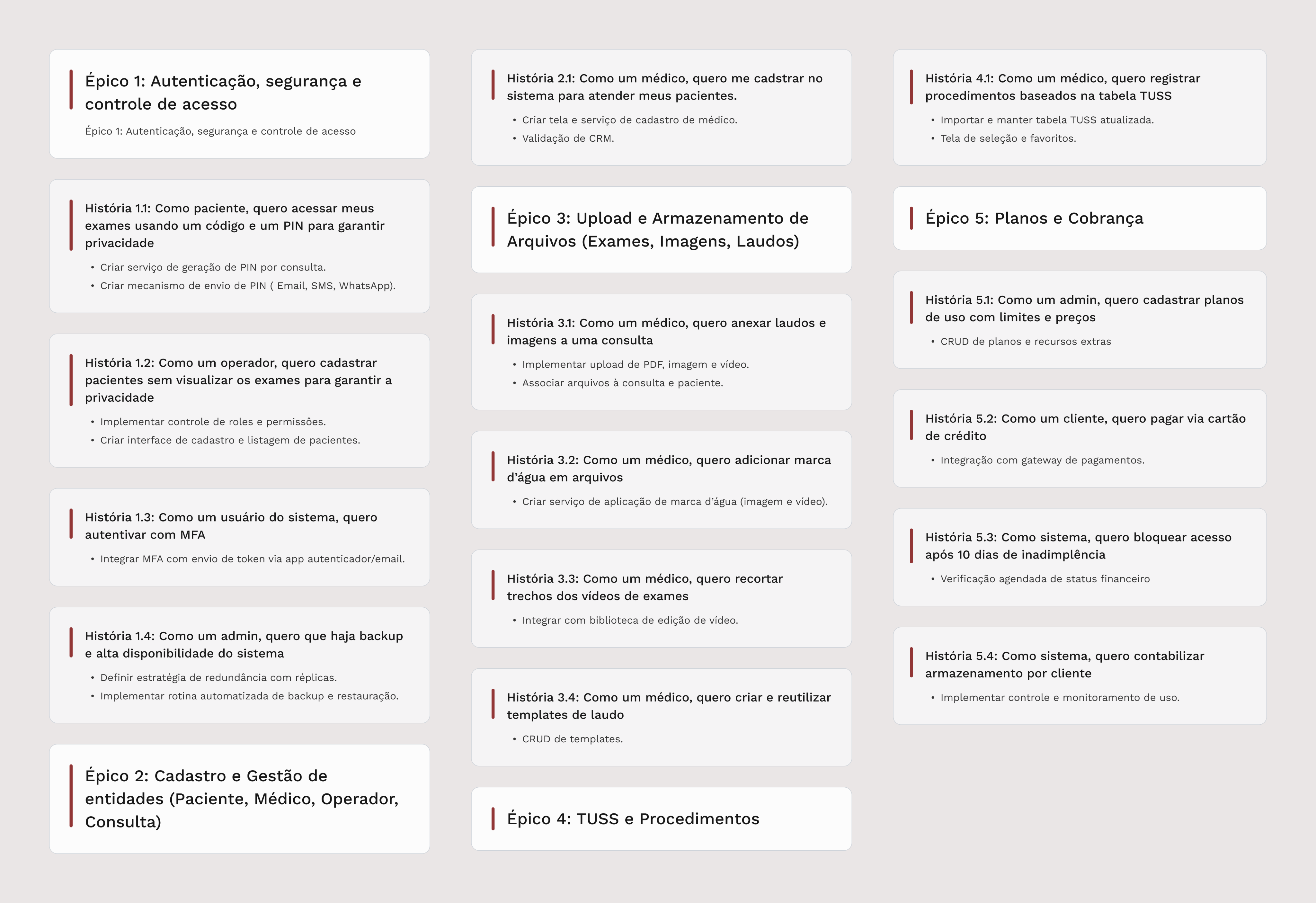
Requirements mapped into epics and user stories.
Structure
Access hierarchy built around privacy
Given the data presented by the client, I understood medical confidentiality as a critical point in defining the product's structure, as it is also a legal requirement for this niche.
Considering this fact and the different potential user profiles, three different views were developed: the Doctor's view, with full administrative control; the Operator's (Reception) view, which can register patients and create appointments but doesn't have permission to view exam results and reports; and the Patient's view, which accesses only their own files through a simplified flow.

Information architecture defining the product's navigation structure and access boundaries per user entity.

Primitive tokens defining the raw palette — the foundation layer before semantic assignments.
Appointment as a folder, not a calendar event
Another important point in the structural design was understanding the appointment as a storage unit for medical reports and exams, rather than highlighting it as an element for scheduling or creating reminders.
In its initial version, MediCloud did not aim to offer an elaborate calendar for tracking and scheduling medical appointments, thus treating the appointment primarily as a folder and a reference for locating files through the system.
The smallest elements of visual decision-making
With the limitations mapped and the platform's base structure designed, I moved on to the first visual decisions using design tokens. I started the project this way because I believed that, given the system's complexity and the tight schedule, working with well-structured tokens and components from the beginning would provide me with faster construction, systemic consistency, and therefore better usability.
I structured the tokens in two layers: primitive (raw palette) and semantic (assignments with functional meaning), so that adjustments would be reflected throughout the entire system and components instantly. The visual language relies on common patterns in the healthcare market, prioritizing the reduction of cognitive load and the transmission of trust as the primary value of the message.
Despite deciding to build the token system early on, at this point neither the token naming conventions nor the palettes and scales were absolutely defined — everything remained subject to testing and later changes.

Semantic tokens mapping primitive values to functional roles across the entire interface.

Typographic system built with Work Sans — chosen for its legibility and professional tone suited to clinical environments.
A sober, digital, and accessible typography
Typography is the most important element in a project, present in every part of the system and guiding much of the hierarchy and rhythm of pages. The choice of Work Sans wasn't just aesthetic. In a clinical environment, where reading dense data is constant, legibility across different sizes, weights, devices, and displays is a functional requirement.
The sober and professional tone of the typeface also reinforces the values of trust and precision that the product needs to convey.
Execution
Components that document decisions, not just visual patterns
Continuing the approach of building blocks before assembling final interfaces, creating the basic components was the next step.
The components incorporated typographic styles, established color and spacing tokens, as well as visual guidelines — such as ample white space to facilitate consumption of dense content and clean aesthetics to ensure greater prominence for the platform's key actions.

Component library built for consistency and precision in handoff — every state documented and ready for implementation.

Given the limited time and need for responsiveness, I opted for cards due to their ease of adaptation across devices and reusability in various contexts.
Given the tight schedule and the requirement to design for at least three screen sizes (phone, tablet, and desktop), I decided to use the card as the main interaction and display element, as it offers ease of use and reusability for various purposes, along with strong responsive adaptation.
As the project progressed, new components and adaptations to existing components naturally emerged, in the color system, typographic scale, and naming conventions.
Assembling the blocks
Some sketches were made in earlier stages to map the needs that tokens and components should address. I started building screens by applying the blocks to the sketched layouts, transforming them into real interfaces, and from there creating the other screens and flows of the system.
The system helped build screens faster while maintaining visual and functional coherence, adapting as needed to best serve interface construction.
The primary flows designed were exam management and report management, which carried the product's core value. The first required a progressive upload service for images, PDFs, and videos, plus watermark addition; the second needed to display a form with multiple fields and steps in the most pleasant and clear way possible.

Report creation flow designed for minimal friction — progressive steps, clear labeling, and consistent behavior across breakpoints.

Diagnostic image upload flow with automatic watermark application — from empty state to exam confirmation.

Diagnostic video editing in the browser: clip trimming and watermark application without dependency on external software.
To improve the form completion experience, I focused on smart auto-fill of fields and the use of correct inputs for each data type. Additionally, I incorporated the creation and use of templates to speed up report composition and facilitate review, as it is a crucial step in long forms.

Demonstration of the report creation flow, with field pre-filling, error prevention, and prioritized review.

Details of the template creation and consumption features for accelerating medical report completion.
Result
Value delivered
The delivered system covered a considerable scope of complexity: multiple access profiles with distinct permissions, file upload and editing flows, and consistent behavior across different devices and screen sizes, even as a first version. The component structure and use case documentation sustained this breadth without loss of visual or functional coherence, delivering what the client requested within the agreed deadline.
The two-layer token system proved its value throughout iterations: adjustments were propagated globally in minutes, reducing the need for local changes. The documentation of components, tokens, and specifications also contributed to a more efficient implementation, reducing ambiguities in the handoff between design and development.
Complex system ready for takeoff
Solid foundation for flexible maintenance and evolution
What I would do differently
Structuring the token system and component library from the start ensured consistency and speed. On the other hand, this path restricted the creative process before the product's identity was mature. The visual language was consolidated too early, limiting the space for experimentation and resulting in a more conservative interface.
For the next opportunity, I would prioritize letting the visual direction mature before formalizing the system. The design system should record what the process discovered, not condition what it's allowed to explore.


